


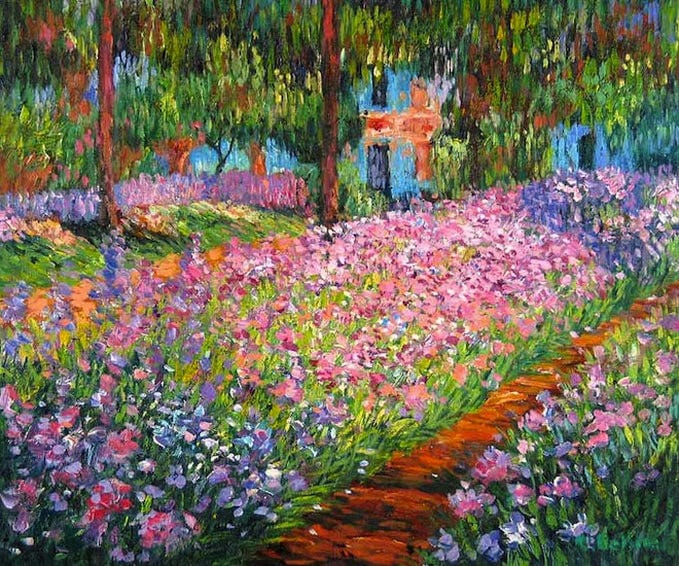
Back in August, whilst on holiday in France, we took a trip to visit Monet’s house and gardens in Giverny. It was drizzly and quite dreary but delightful nonetheless. I was surprised at how special it felt to be standing on ‘that’ bridge from the Water Lilies painting that’s truly synonymous with Monet. As we meandered around the grounds we managed to spot a few other scenes that we recognized from his paintings. The flowers were insane and planted in large color specific sections. The spectrum of hues within each segment was really something. I loved seeing how the colors bled into one another just as they do in the rainbow.


The kids and I completely lost track of time taking approximately 8 million photos of the flowers (declaring each one to be our very favorite), and only left ourselves a tiny bit of time to look around Monet’s house. Bad call. I honestly thought we’d pop in briefly just to say we’d seen it (classic tourist!), but wow, it was spectacular inside! I was sad we didn’t allow more time to fully take it in. Admittedly, it was very busy and we were kind of pushed through in the way a crowd tends to carry you along, but I managed to snap a few pics here and there, trying to capture little vignettes that caught my eye.
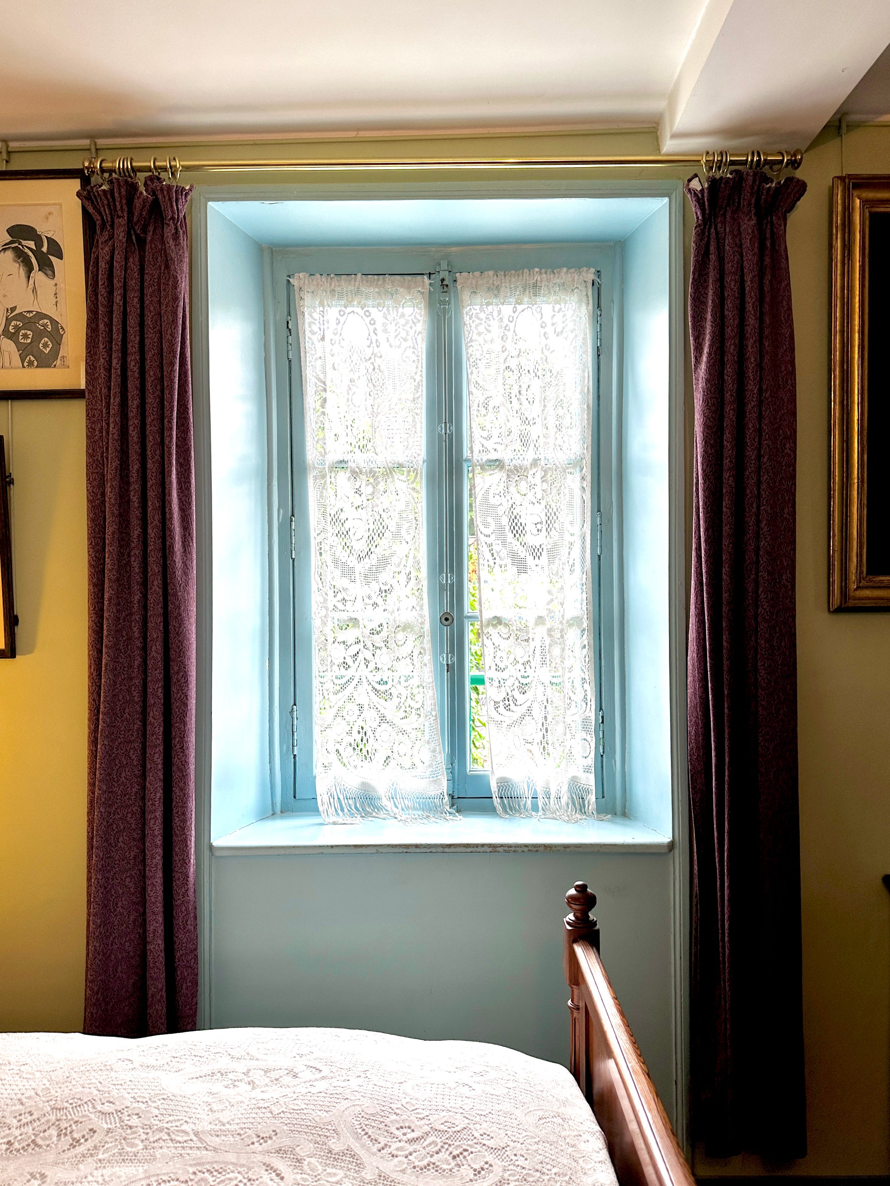
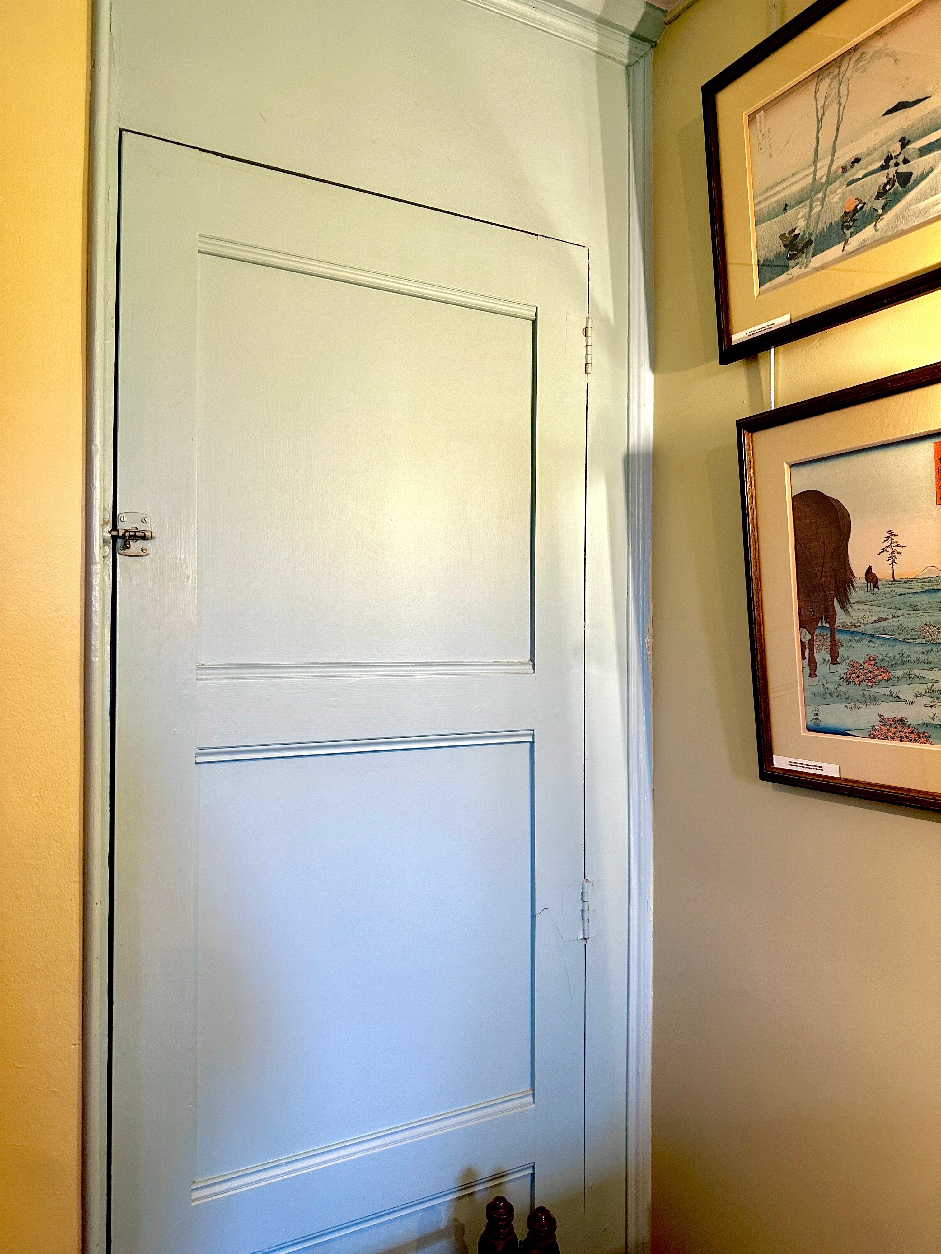
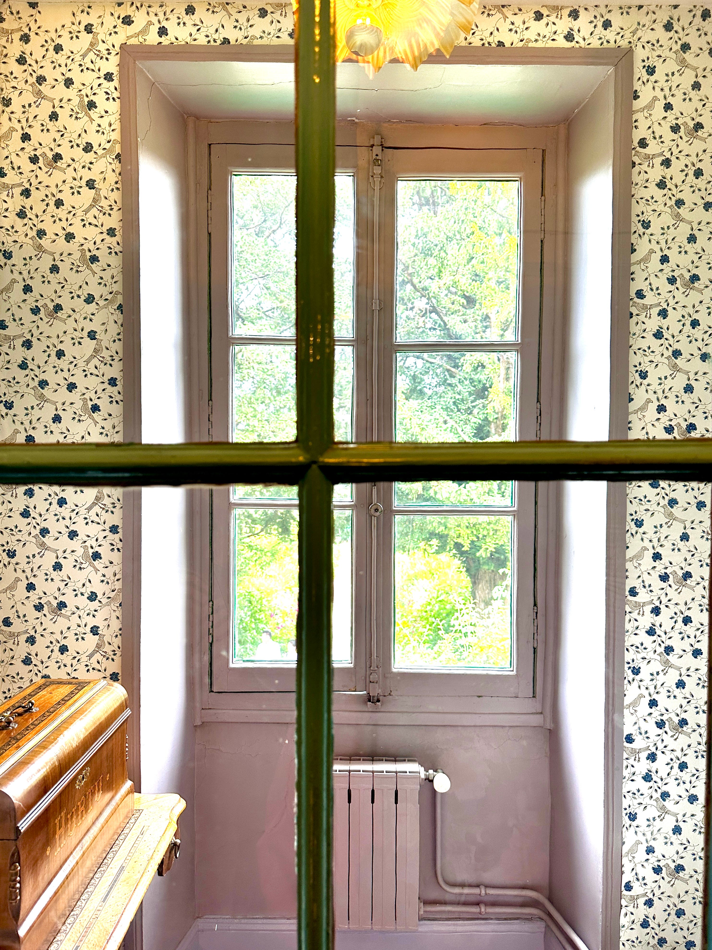
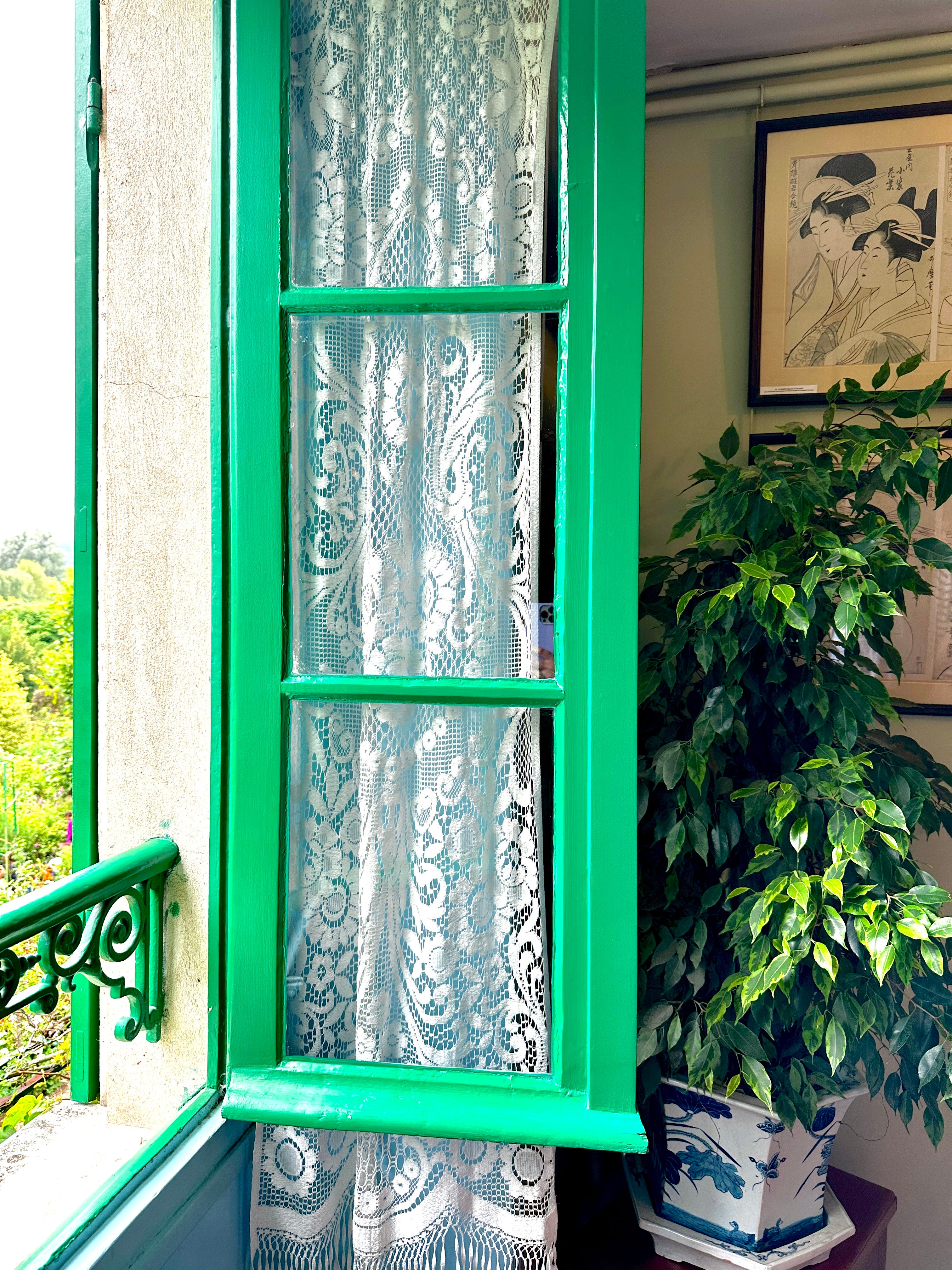
Before entering the house, I had expected it to be decorated in a rather rudimentary or provincial fashion. I visited many many many many National Trust properties throughout my childhood in England, all of which are all very predictable when it comes to their decorated interiors. But Monet’s house is anything but predictable. It doesn’t have the grandeur of a historic stately home, rather it is playful and vibrant and full of color. Each room has character and warmth and a real sense of energy. As I walked through, I couldn’t help but think that it wouldn’t take much for these rooms to look right at home on the pages of Architectural Digest today.
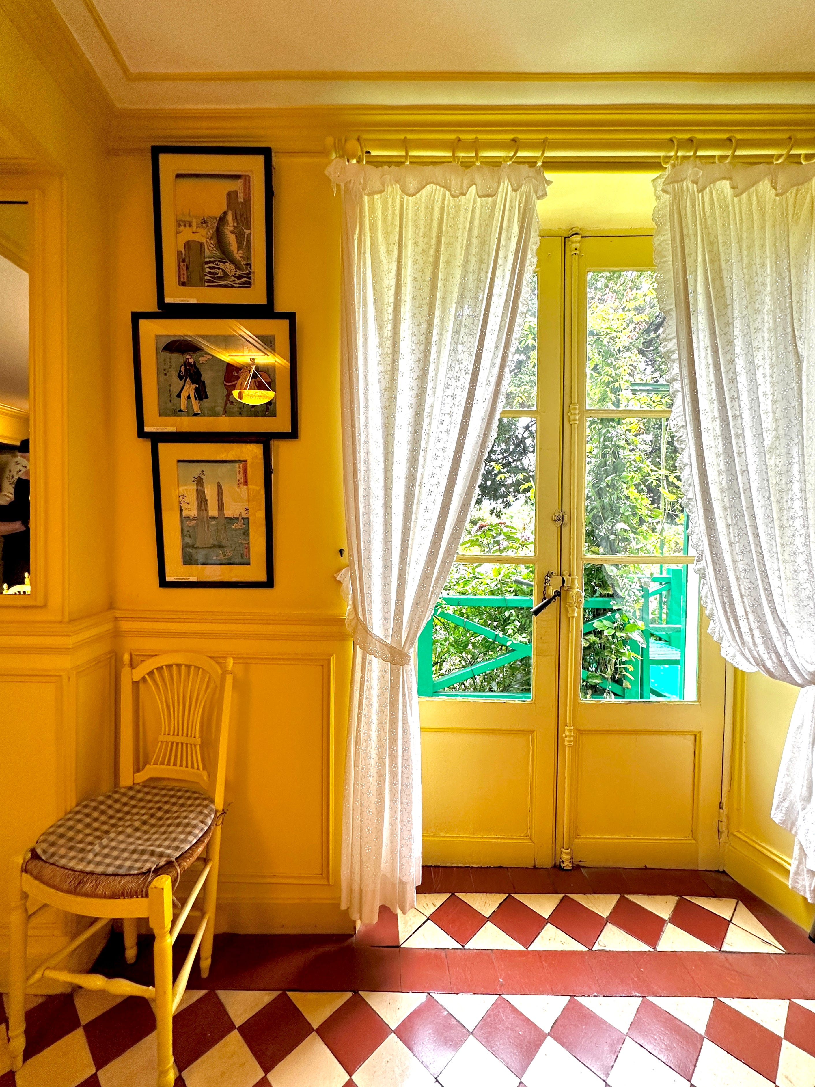
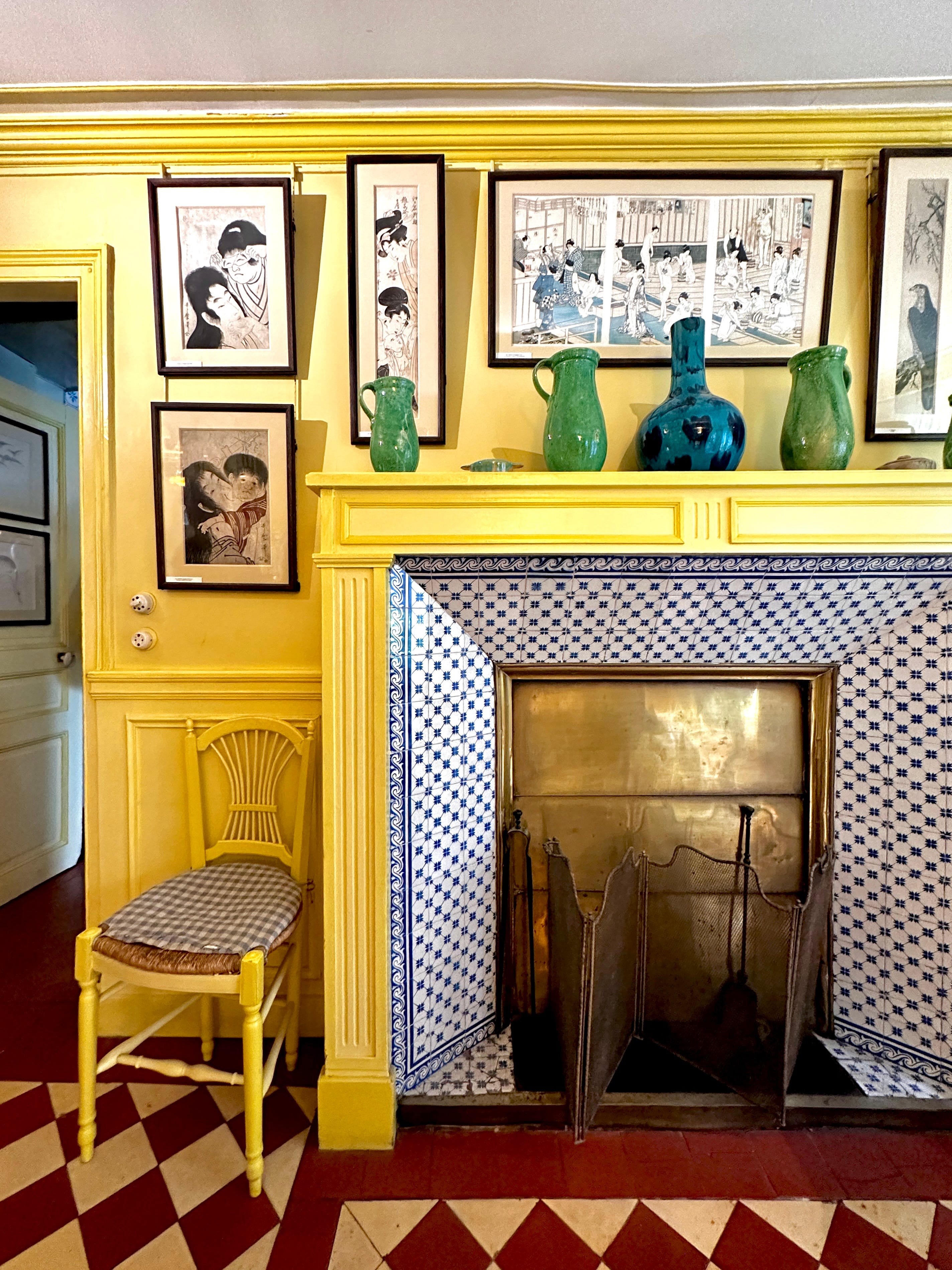
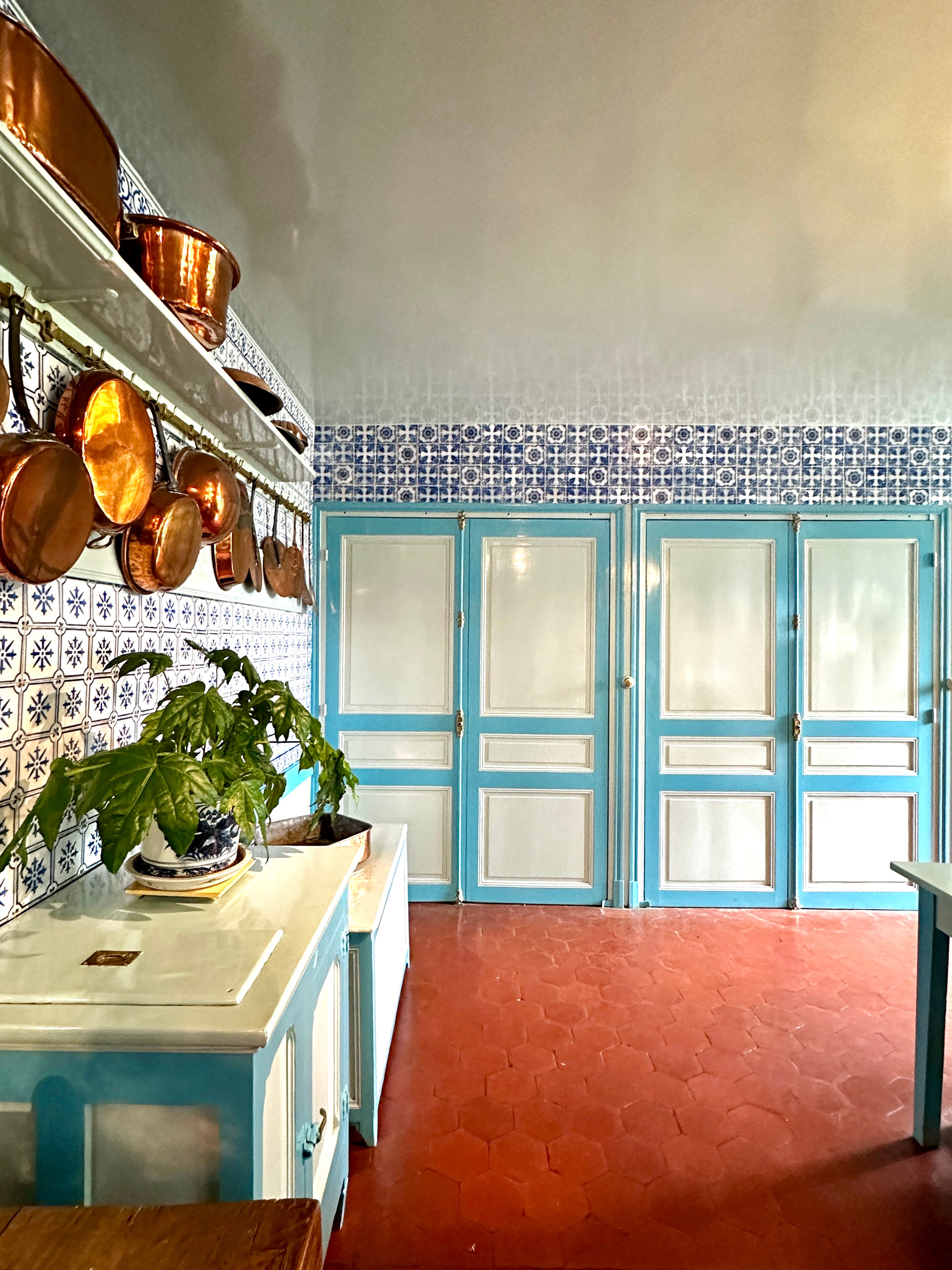
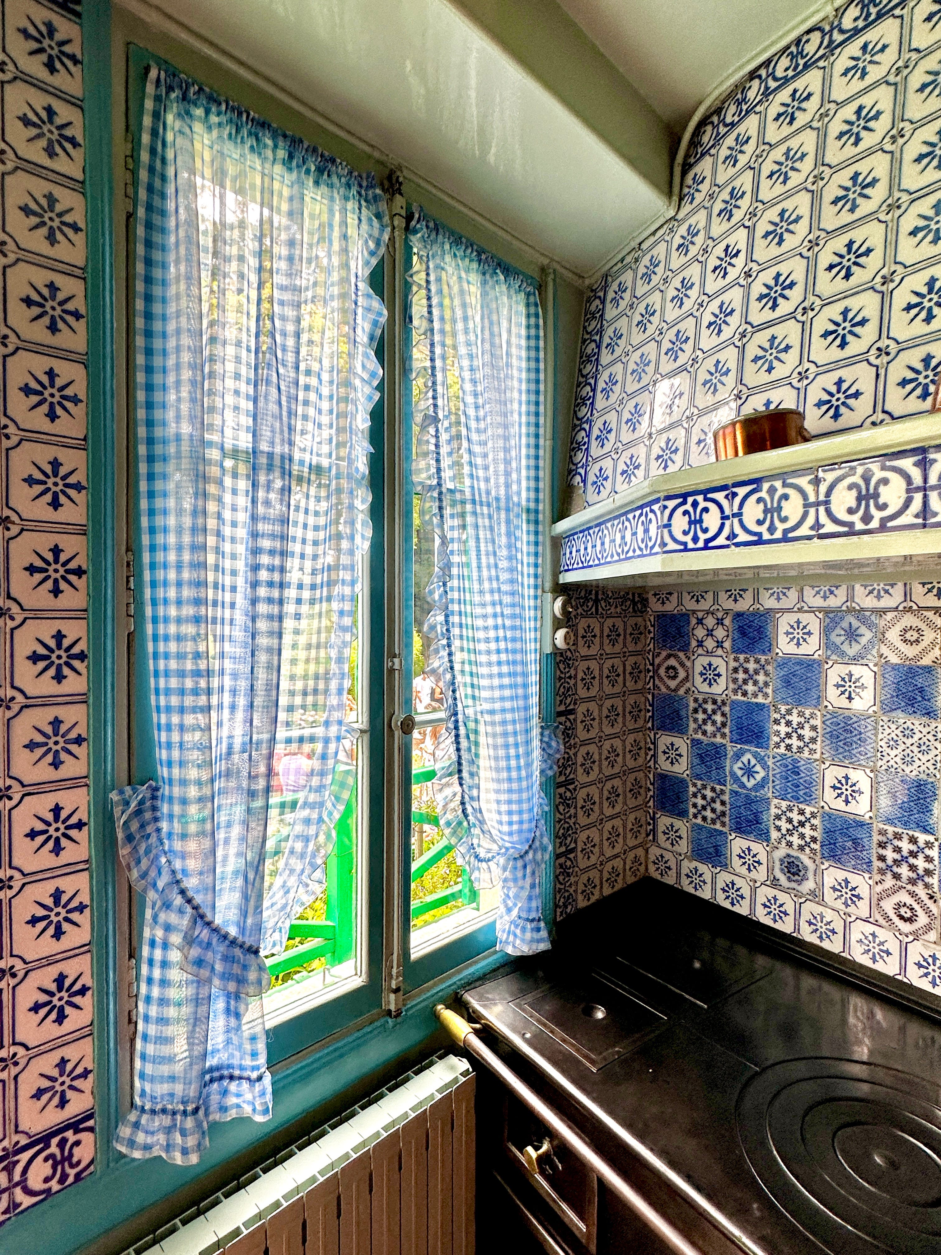
I especially loved the color blocked windows and the choice to take the color floor to ceiling and across all the woodwork, too. It feels very fresh, very current.
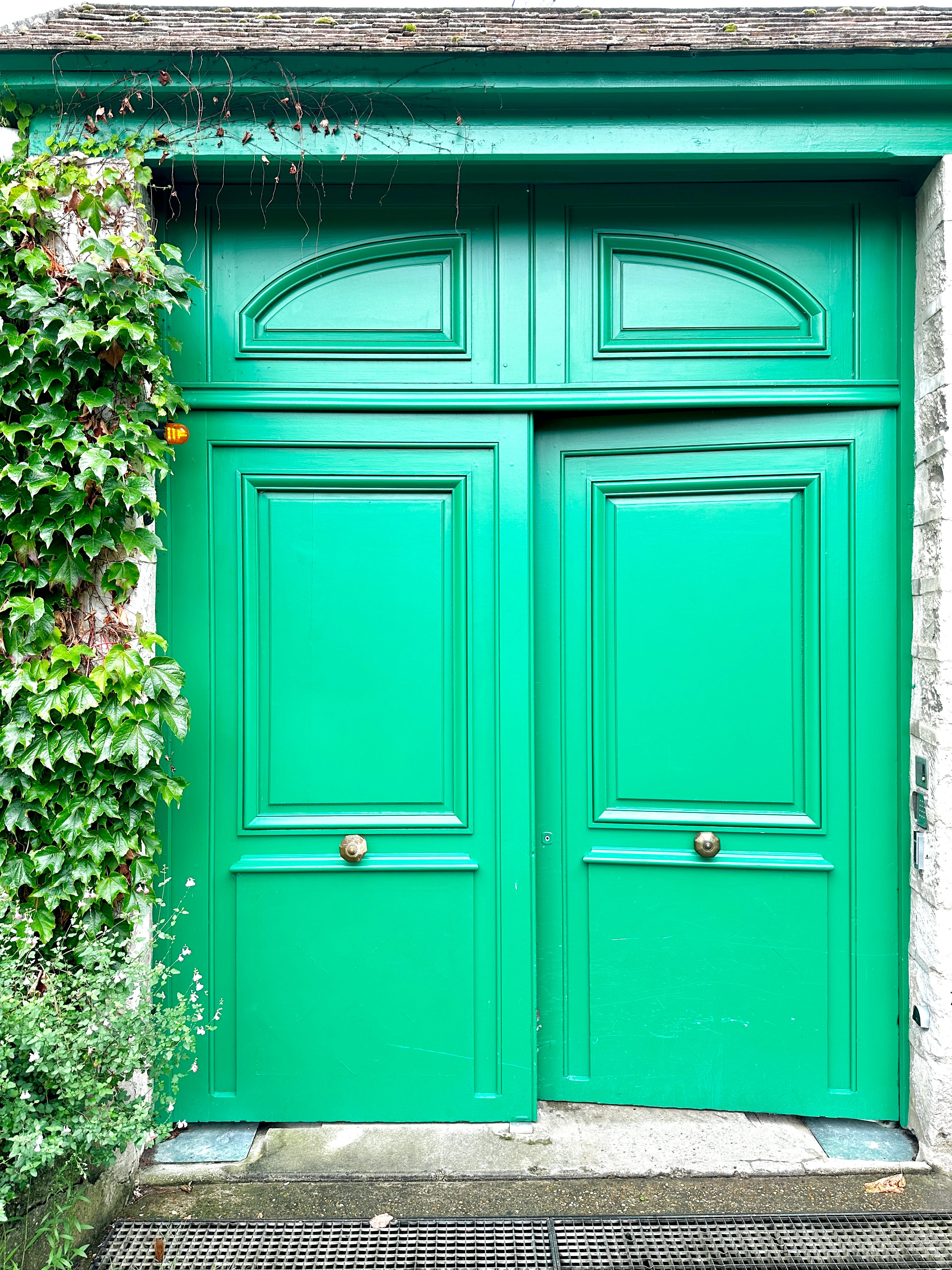
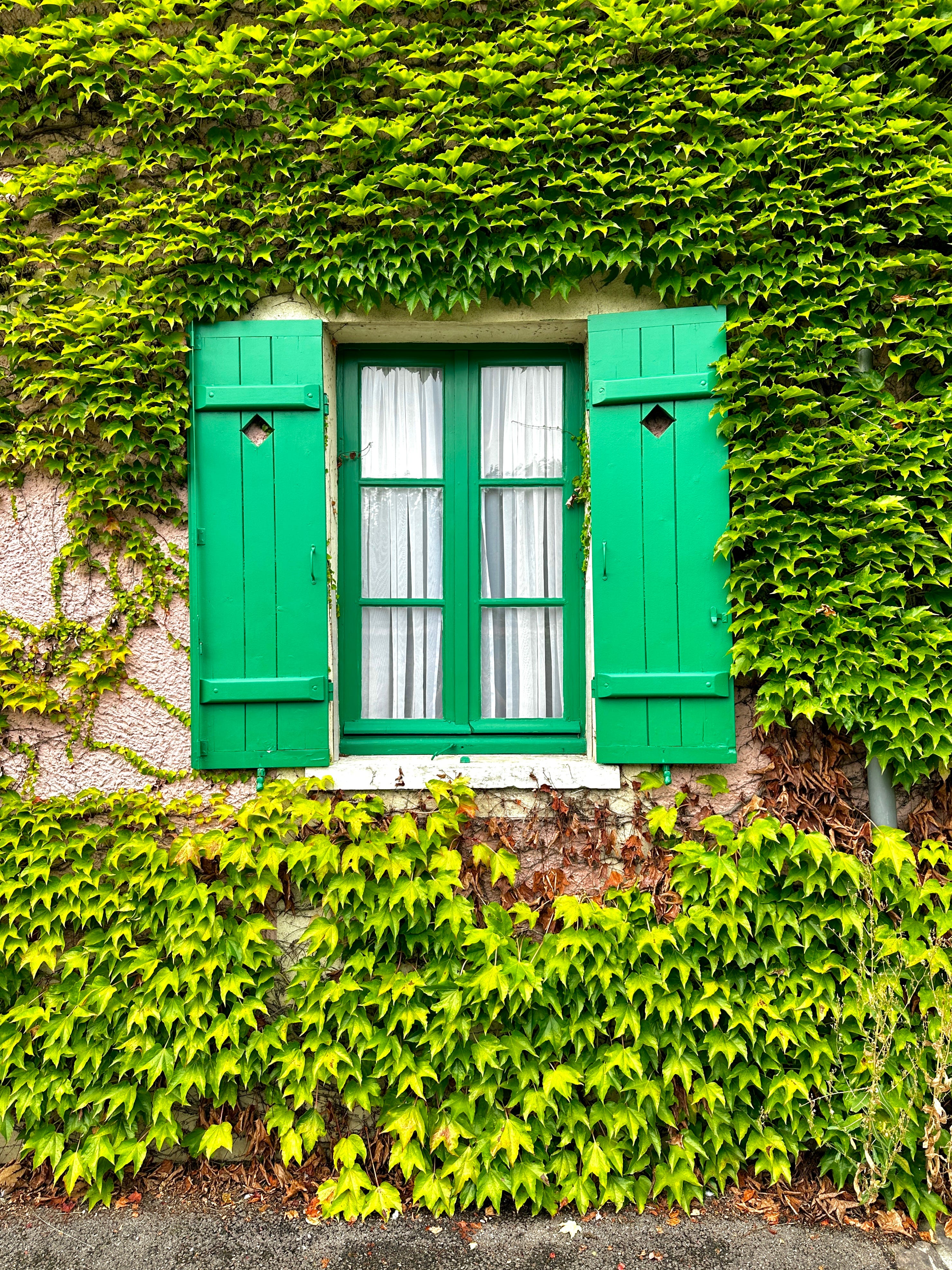
We arrived in Giverny with umbrellas up and raincoats on, so it wasn’t until after, when the skies began to brighten, that I noticed the abundance of green paint used throughout the village. A lush, vibrant, verdant green adorns the doors and window frames throughout, and I was fascinated by how simply switching the natural browns of the wood - that we’re so used to seeing in these places- with this vivid, happy green, just completely changed the entire feel of the space. It was clearly a choice. Someone, at some point in time, had made this decision and as a result every door and every window was given personality and an opportunity to be noticed. A small gesture, but one that goes a long way. No stone left unturned or something of that ilk.
In retrospect, it should be of no surprise that Monet’s home is an absolute triumph in color. I think it’s fair to say he knew a thing or two about it.
It’s been a few weeks since our visit and I still find myself telling people about it; excited to talk about how color has been present in our homes for a day and an age, that it shouldn’t feel so out there or peculiar to want our homes to have personality. In recent months I’ve had the opportunity to work with clients who were seeking brave, bold color in their homes and the results just make my heart sing.


Copyright: Shapes For The People. Photos by Aimee Ryan
Color consultations are such special projects to be a part of. I love helping people tell the color story of their home. And if you just need a fresh pair of eyes to help you get started with a project or to help push it over the finish line, you can always schedule a Color Chat with me, too. An hour of your time well spent!
I love the shiny / reflective ceiling paint! I feel like I don't see that often, but it just makes those rooms sparkle ✨