


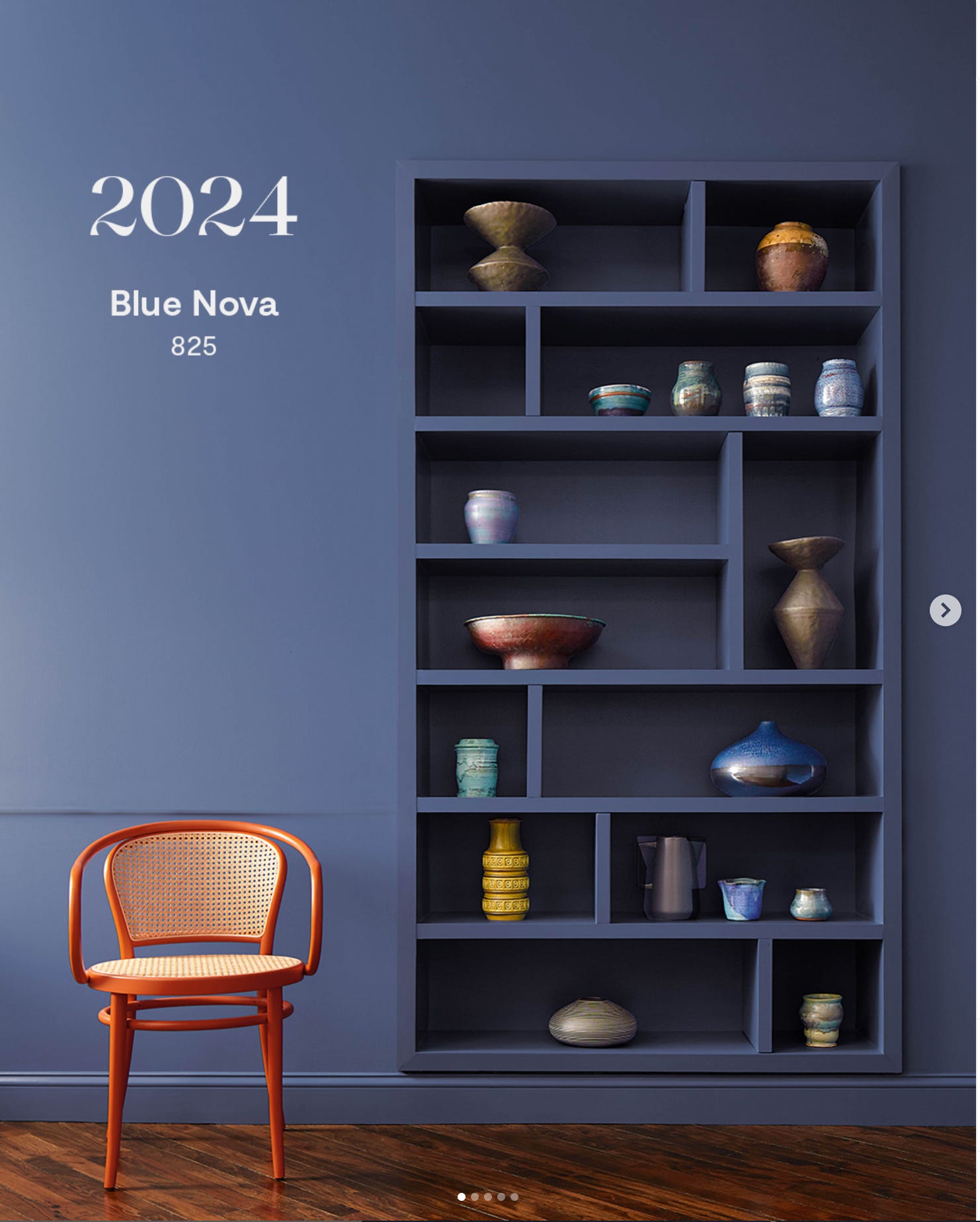
And we're back to the Color Of The Year thing
Well, it’s been a whole year since we addressed the Color Of The Year 2023 and here we are again looking at what the color forecast is for 2024. And I have to say, I’m really quite surprised with the choices this year.
Everything I’ve been hearing over the past few months has been hinting that we’re moving yet again towards warmer, creamier neutral tones and darker, moodier colors with a softer and smokier edge. With that in mind I was truly expecting something from the brown or cream family, maybe green too:

Or anything from the Christian Siriano Collection for Sherwin Williams

And yet here we are with both Benjamin Moore and Sherwin Williams selecting a blue! Yep, you heard that right… Blue! Such a surprise that I find I’m struggling to get on board with. Benjamin Moore’s Blue Nova definitely feels warm and subtle. It’s gentle and cosy. But, but, but! Hasn’t Navy had had it’s moment?! Or perhaps it’s just cementing itself as a modern classic to keep coming back to? I remain confused.
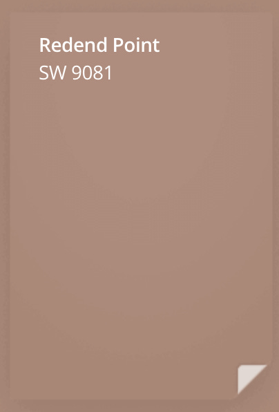
Sherwin Williams’s pick for 2023 pick would be (in my extremely humble opinion) right at home in 2024. It’s organic, earthy tone feels like it matches the mood and the direction that interiors are heading
And yet, in complete contrast, this is their 2024 color, Upward.

It’s light, airy, summery, coastal and cool. A far cry from the Clay Pot tones of Redend Point. It also leans quite grey which I was absolutely certain we’d put to bed for the time being.
From their website:
“Introducing Upward, a breezy, blissful blue. The color found when we slow down, take a breath, and allow the mind to clear.”
“A hint of silver lining”
“A sunny-day shade for spaces brimming with positive energy, creative thinking, and total contentment.”
As always, the color forecasters make these predictions by studying a variety of sources to gauge the collective ‘temperature’ amongst us. What do we need? What are we seeking? What are we craving for more of? What do we want less of?
So although Upward feels a little left field, I’m on board with anything that inspires positivity and creativity, and I think we could all be encouraged to take more time to breathe. I’m pleased to hear their reasoning resonates with the where the world is at.
I was absolutely thrilled, however, the find that Behr is giving Cracked Pepper the acclamation it deserves, choosing it as their 2024 Color of the Year. Cracked Pepper has been my favorite black for, well, ever. My go-to for every mural project and I’m so pleased to see it getting more attention. It’s charcoaly, smokey, soft and elegant. And it’s black. It’s not blue-black or green-black, or brown or grey. It’s steadfastly black. It’s the best. Hooray!

It probably doesn’t really need saying, but there’s really no reason to care all too much about these Color of the Year choices. If you like the colors and would have chosen them anyway, fantastic, if not, you can leave them be. No pressure. Good vibes only and all that :)
As always, I love to talk all things color and am having the time of my life advising you through my Color Chat service. This week alone we’ve covered exteriors, bathrooms, hallways and landings, open plan first floors and more! Go ahead and schedule one, I promise we’ll have a lot of fun!
In other color-related news, I’m partnering with Josi from Wildly Floral again to host a weekend retreat in The Catskills. Camp Wildly is perfectly timed to coincide with your spring awakening, and will be full of color discovery and floral exploration. It’s sure to be a beautiful weekend. Hope to see you there!
When does Pantone’s reco arrive?